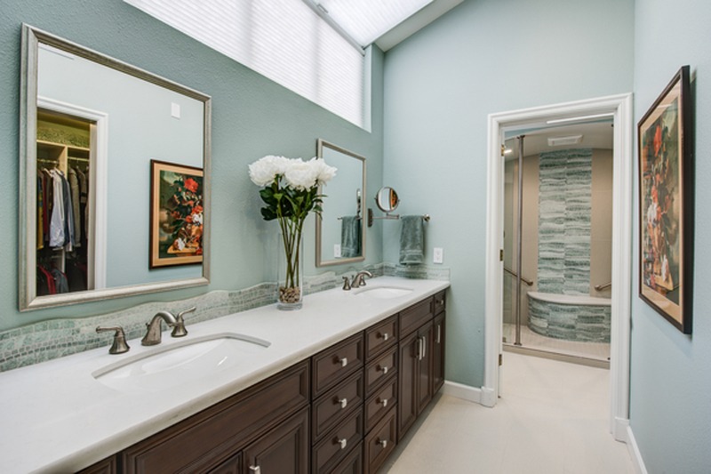
Gilmans Design+Build Team recently wrapped up a condo project involving a Kitchen, Breakfast Nook, Dining Room, Living Room, Guest Bath and Master Suite. Basic upgrades were made throughout the unit, making for a cohesive style that we will be showcasing room-by-room over the next few postings.
The Master Bathroom is the most dramatic feature, the final result is pictured above. Let’s take a look at where we started and how we got there:
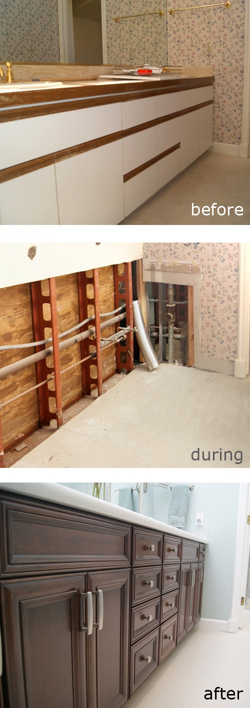
The existing top mounted sinks and vanity left much to desire.
Floral print wall paper throughout the space, reflecting in the full width wall mounted mirror.
Brass fixtures and accessories carry throughout the space.
Carpet in this ‘wet area’ is slated for removal in favor of tile.
The exterior wall shown consists of metal framing. In order to secure the future vanity cabinets, blocking will be added.
New supply lines and valves will be installed for the double sinks planned.
The mirror is removed, the wallpaper will be next and all wall areas will be patched and re-textured to match.
Dura Supreme Crestwood line “Sophia” Mocha on Cherry vanity with Maple Melamine interior houses the double under mounted Kohler “Kelston” sinks.
Pencil edge detail on Caesarstone “Frosty Carina” 2cm quartz countertop compliments the vanity style.
Satin nickel hardware finish the look.
Check out a closer view of the ‘before’ and ‘after’ of the new sink/faucet area:
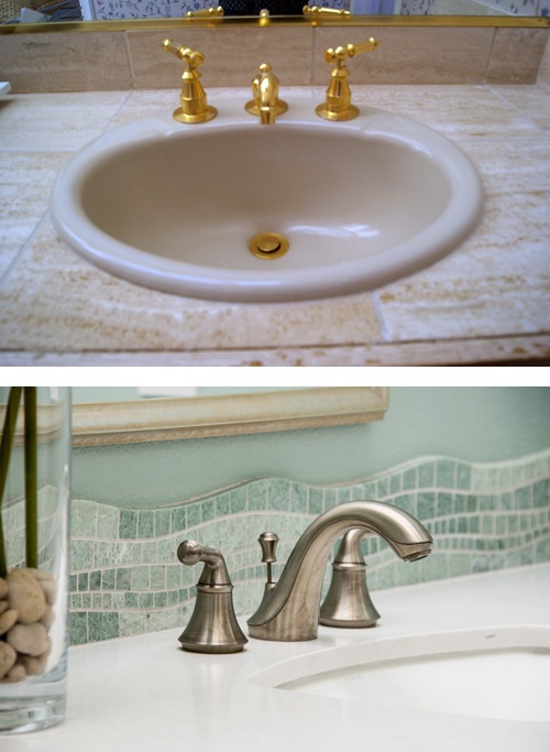
Accent tile shown here as the back splash was the inspiration for the space. The curve and irregularity of the tile give the illusion of water movement, the sense of a waterfall and stream achieved through a vertical installation that cascades down the wall and across the curve of the bench. That along with the existing arch across the existing shower/tub area are the main architectural architectural features in this wet/dry space. Check out a progression of the shower area:
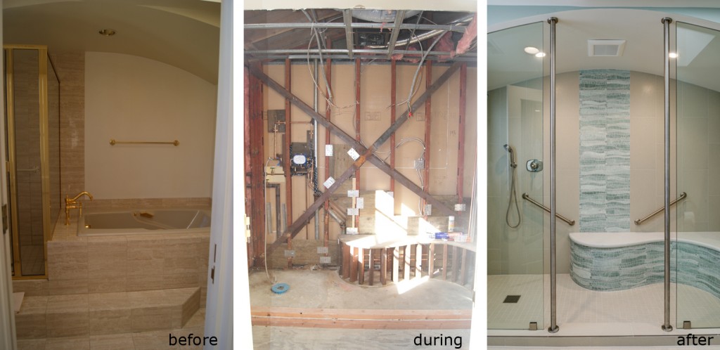
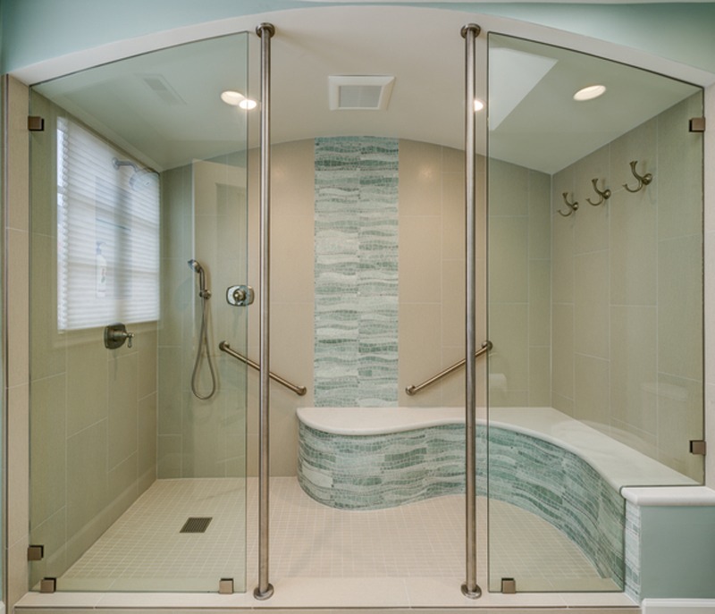
Important to the client was future ease of use as they intend to ‘age in place’. Removing the tub to create a larger shower space was the first move. Since the unit is on the top floor, there were constraints on lowering the drain, prohibiting installation of an ADA compliant flush mount curb. Instead, a regular height curb was installed and floor-to-ceiling grab bars flanking the opening allow for stability when entering or exiting the space. A heated solid surface Caesarstone bench spans the ‘wet’ and ‘dry’ side of the shower enclosure. Space to sit whether utilizing the shower space to clean up or dry off, allows for comfort and safety.
In a close up view of the bench you can see variation in the natural stone and ghe pattern of the accent tile:
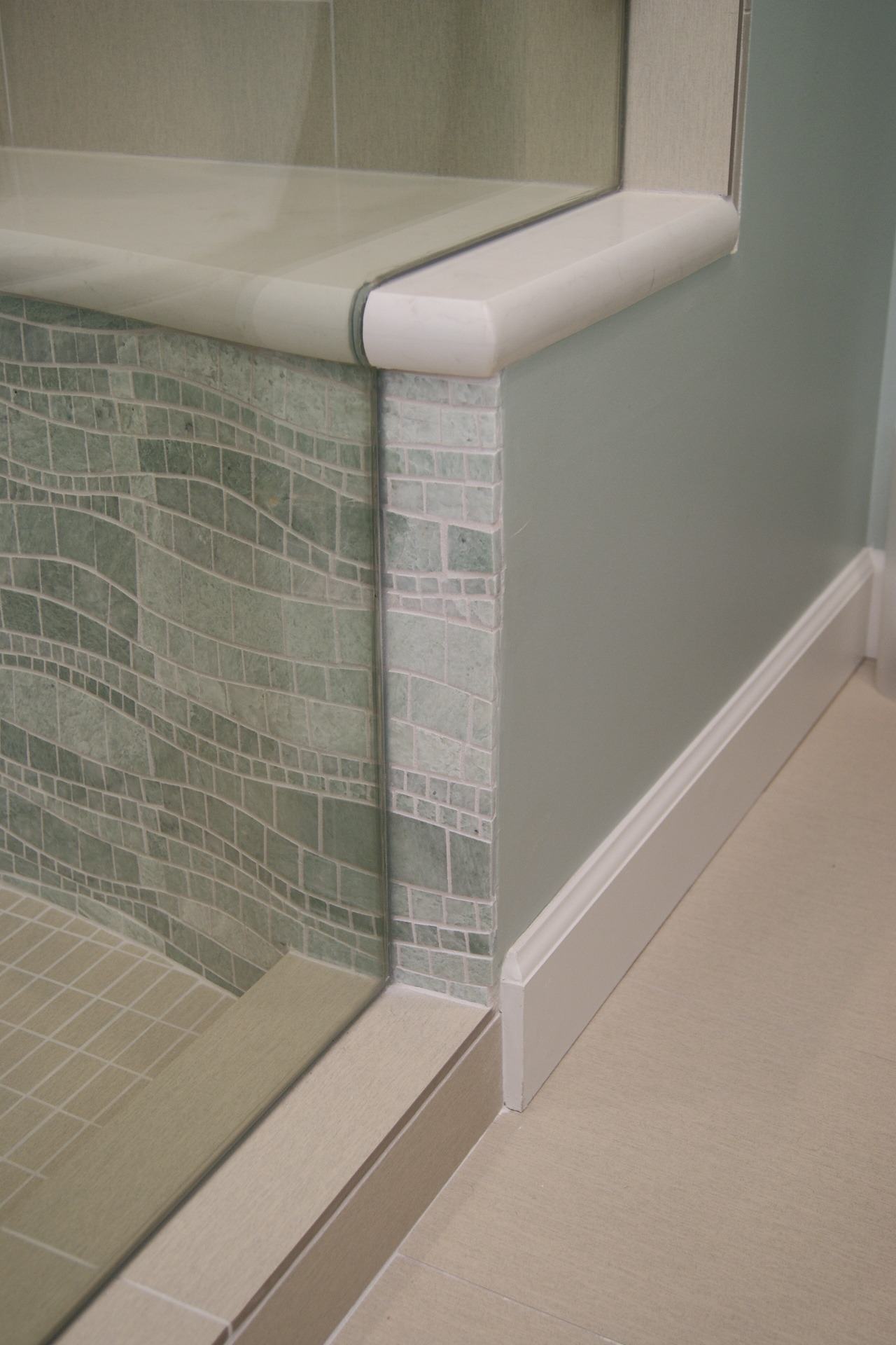
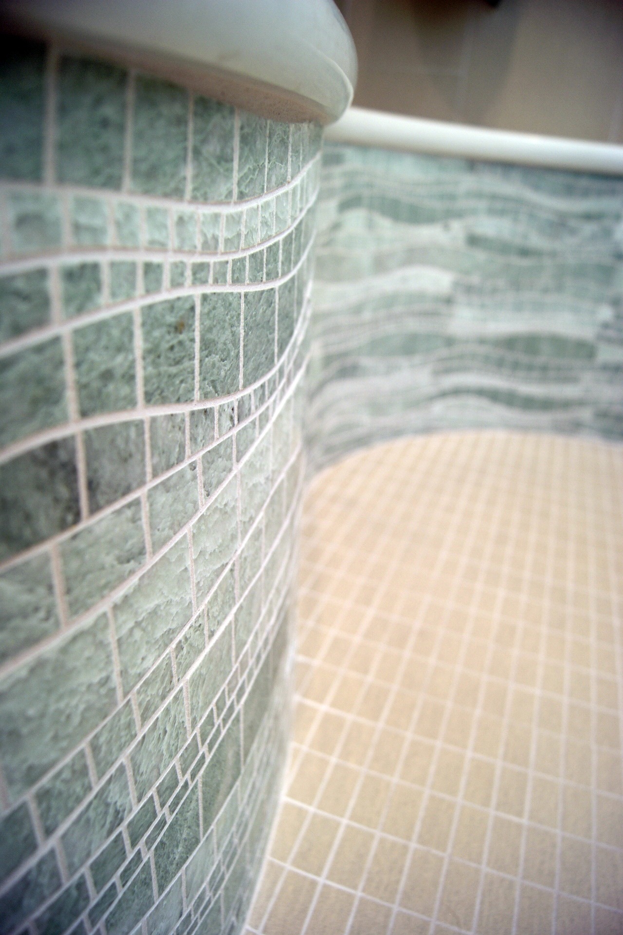
To set it off, sheets of porcelain 1×3 in the same material as the walls provide a neutral background, geometric grid lines further highlight the movement of the accent material. The same counter top material as the vanity was used as the bench top, including the pencil edge detail tying the two spaces together. Frameless fixed tempered 1/2″ Diamond Sealed shower glass panels custom fit from the curb up to the ceiling.
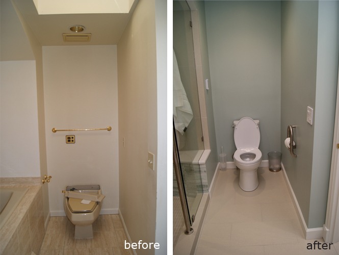
Thermostat control for the heated bench is mounted in the alcove above the toilet and an ADA compliant toilet paper holder installed with backing to provide stability when standing or sitting:
Among the features described above, extensive design details of the space can be found throughout. In this final overall view of the shower space note the square drain, shower head/ handshower and robe hooks mounted opposite the plumbing wall which define the dry area:
Check back for the next post of this condo overhaul!
